Gifting has never been easier
Perfect if you're short on time or are unable to deliver your gift yourself. Enter your message and select when to send it.

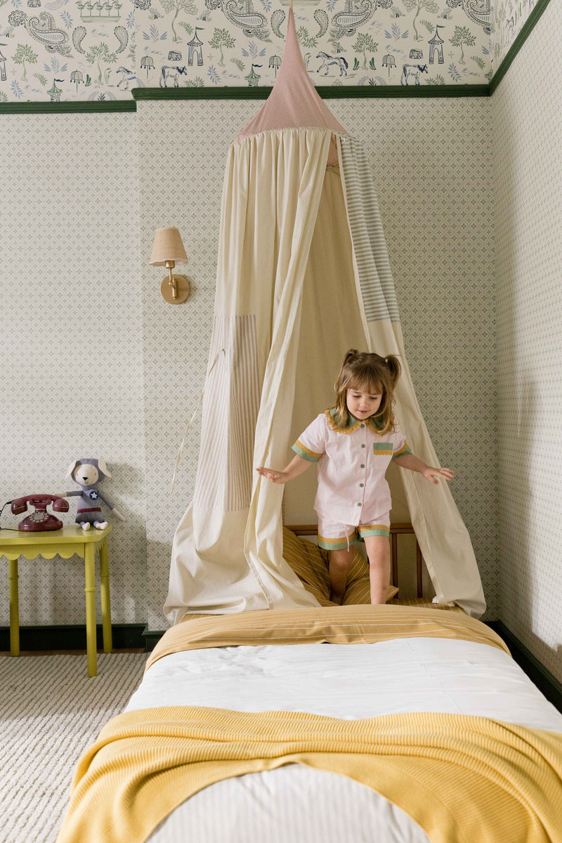
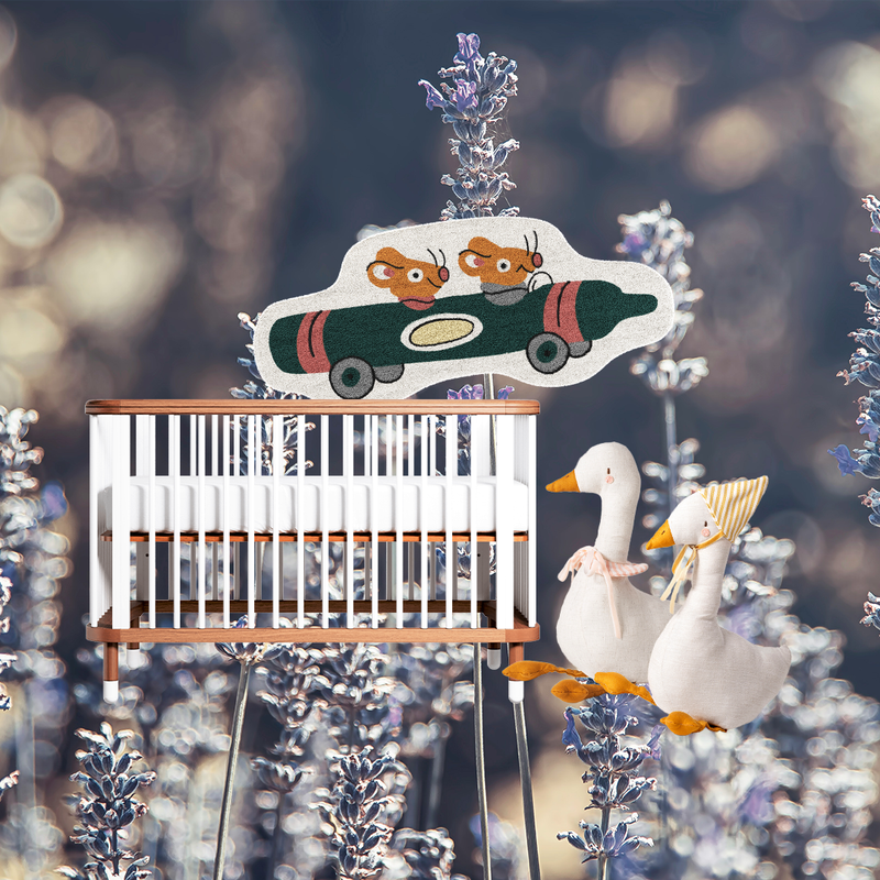
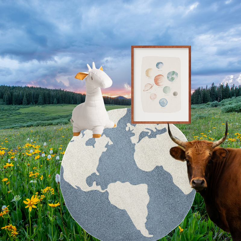
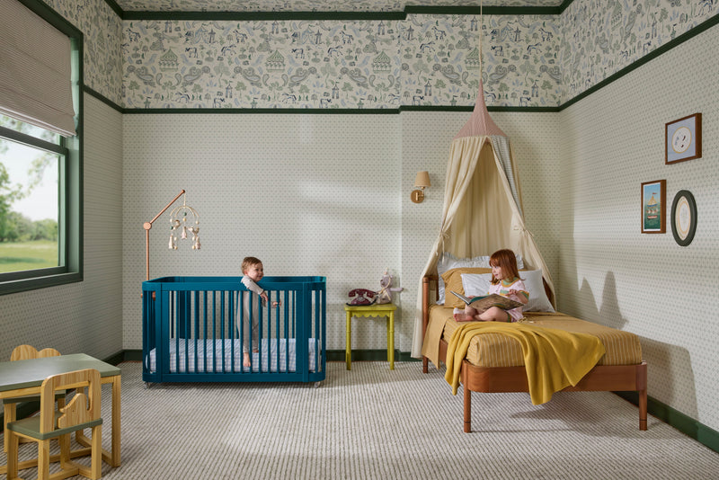
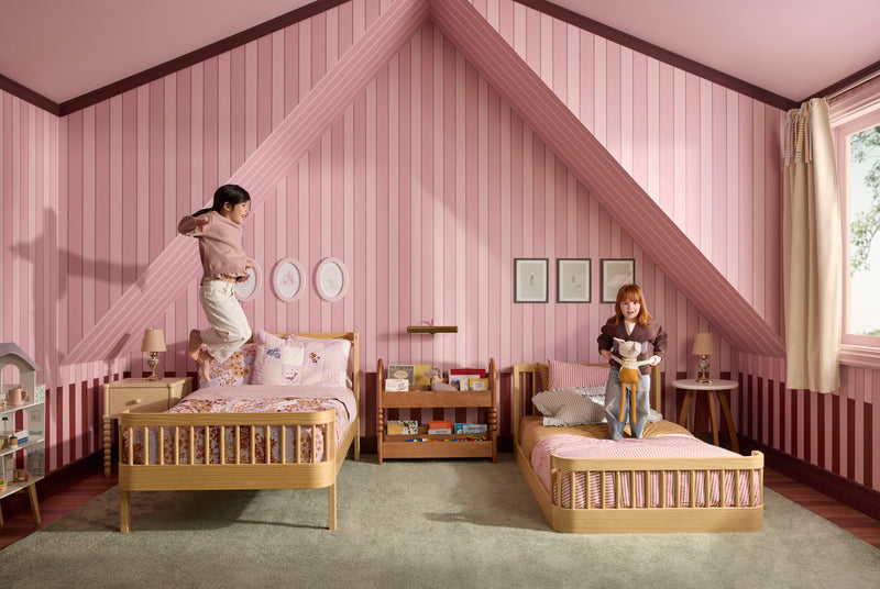
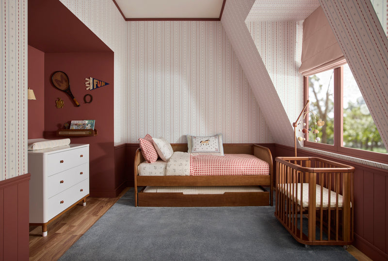
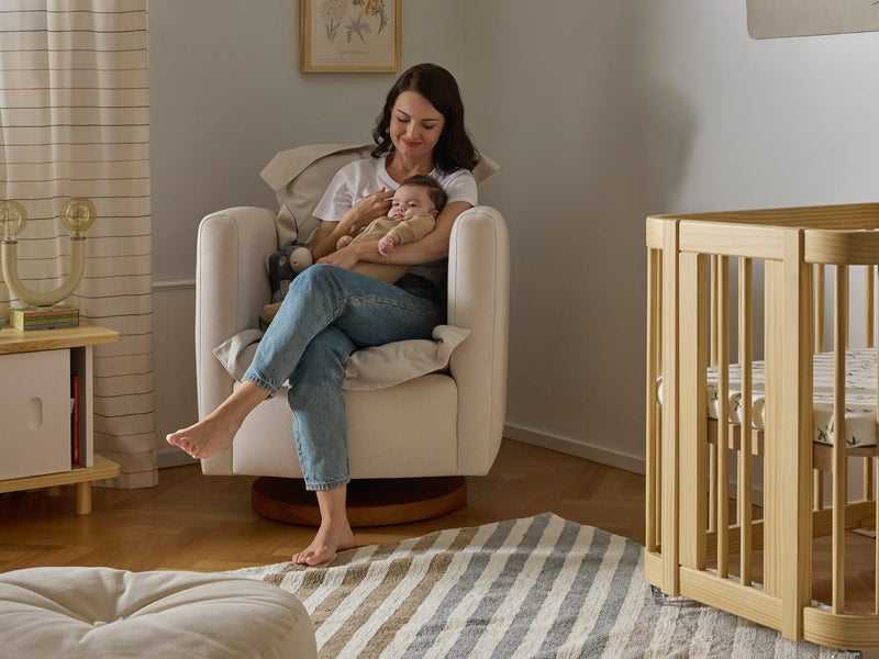
Who says nurseries have to stick to soft pastels? Mixing unexpected tones can make a room feel lively, inviting, and full of personality. With the right balance of bold and grounding accents, you can create a space that’s playful, stylish, and timeless—all at once. In this post, we’ll share tips and inspiration for bringing fresh, unexpected color combinations into your nursery.
Cobalt blue and marigold? Peach and forest green? Sometimes the most unlikely color pairings are the ones that just work—in art, in fashion, even in your living room. But traditionally, when decorating a nursery, it can feel safer to stick to the tried-and-true combinations and not rock the boat too much. After all, the room is going to evolve as your child grows, and you want to make a lasting decision.
But, that doesn’t mean you need to color inside the lines. If you’re looking to shake things up and try a combination that feels unexpected and fresh—we’ve got you. In honor of the launch of our new bold crib colors—we tapped Eva Bradley of the Charleston-based Eva Bradley Studio to share why sometimes the most original and eye-pleasing color combos the ones you’d least expect—and how to bring that sense of bold balance into your kid’s nursery, room, or beyond.
“Red and sage green really work because green is the complementary color to red on the color wheel,” Bradeley shares. “That natural opposition creates visual interest while still feeling grounded. Choosing a softer, more muted green like sage ensures the contrast isn’t too harsh, helping the red stand out without overwhelming the space.”
“I would pair the Wave in Color Crib in Cherry, which is definitely a bold statement piece, with soft sage accents. The muted green balances the intensity of the red, making the overall look feel harmonious and inviting.”
Bradley also shares that from a color psychology perspective, red brings energy, warmth, and vibrancy, which in turn can make the entire space feel more lively and engaging. While on the other hand, because green is associated with growth and calmness, it balances it out. “Together, they create a space that feels both stimulating and soothing—great for a nursery,” Bradley shares.
So how do you bring it in? You could incorporate in the sage green through crib sheets, a wall hanging or textile art, or even on the wall. “These elements will help reinforce the color story while adding softness and texture to the space,” Bradley shares.


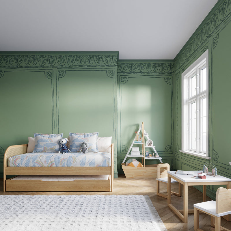
Another must-try pairing? Green and rust. “This works because you’re pairing a calming hue like green with an earthy tone like rust,” Bradeley suggests. “The rusty orange adds warmth without feeling overly bright or primary, while the green keeps the palette rooted in nature,” she says.
She recommends anchoring the space with the Wave in Color Crib in Grove, and introducing the rust through accents like a throw blanket, upholstered glider, or even an artful rug. “A rust-colored linen curtain or textured pouf could also help bring the palette to life,” she adds.


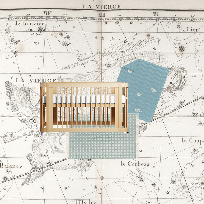
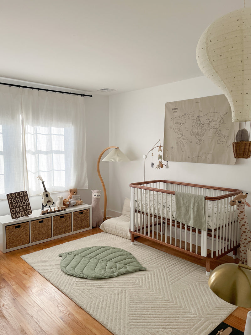
For those looking to add a little more dimension to light blue (which is oftentimes a nursery go-to), Bradley recommends pairing it with camel. “The warm camel contrasts with the coolness of the blue, adding both depth and balance to the space,” she shares. “It elevates the softness of the crib’s tone while preventing the palette from feeling too cold or muted. The camel introduces warmth and richness, helping bring in a touch of natural earthiness.”
In terms of the psychology behind it, the light blue evokes a sense of restfulness and serenity and the camel brings in feelings of stability. “Together, they create a space that feels both peaceful and inviting,” Bradeley notes. You can play around with the combination by bolstering the crib's color with items like storage chests or wooden bookshelves. “Even wood tones with a camel undertone can reinforce the warmth and contrast beautifully against the cooler crib finish, she adds.


There’s a reason why butter yellow is everywhere—it’s a soft, complimentary tone to many bolder, richer hues. And Bradley thinks incorporating into the nursery is no different—especially when paired with navy. “Soft yellow adds a gentle brightness and warmth that lifts the space, while deep blue provides depth. The two colors contrast just enough to remain soft and soothing when chosen in more muted tones.”
It’s a classic pairing that adds cheerfulness and visual interest. Blue is often associated with calm, trust, and rest—making it a smart choice for a crib. The lightness of the yellow adds in optimism and a gentle, summery energy. You can bring in butter yellow through wall art or an accent pillow ro throw. “A pale yellow curtain or a piece of upholstered furniture in a buttery tone could also help tie the palette together in a subtle and joyful way,” Bradley adds


So whether you’re drawn to bold contrasts or more subtle color surprises, these pairings offer a fresh spin on nursery design and are proof that playful can still feel polished.