Gifting has never been easier
Perfect if you're short on time or are unable to deliver your gift yourself. Enter your message and select when to send it.

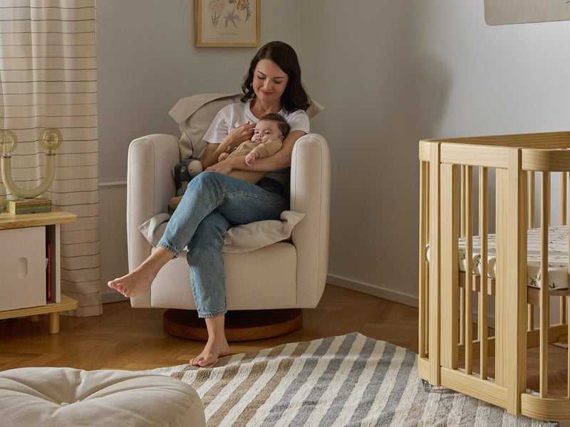
There was a time when seating wasn’t meant to steal the spotlight. Sofas and chairs blended in, acting as a quiet backdrop while throw pillows and blankets did all the talking. Neutral tones, low-key textures, and understated silhouettes were the default choices.
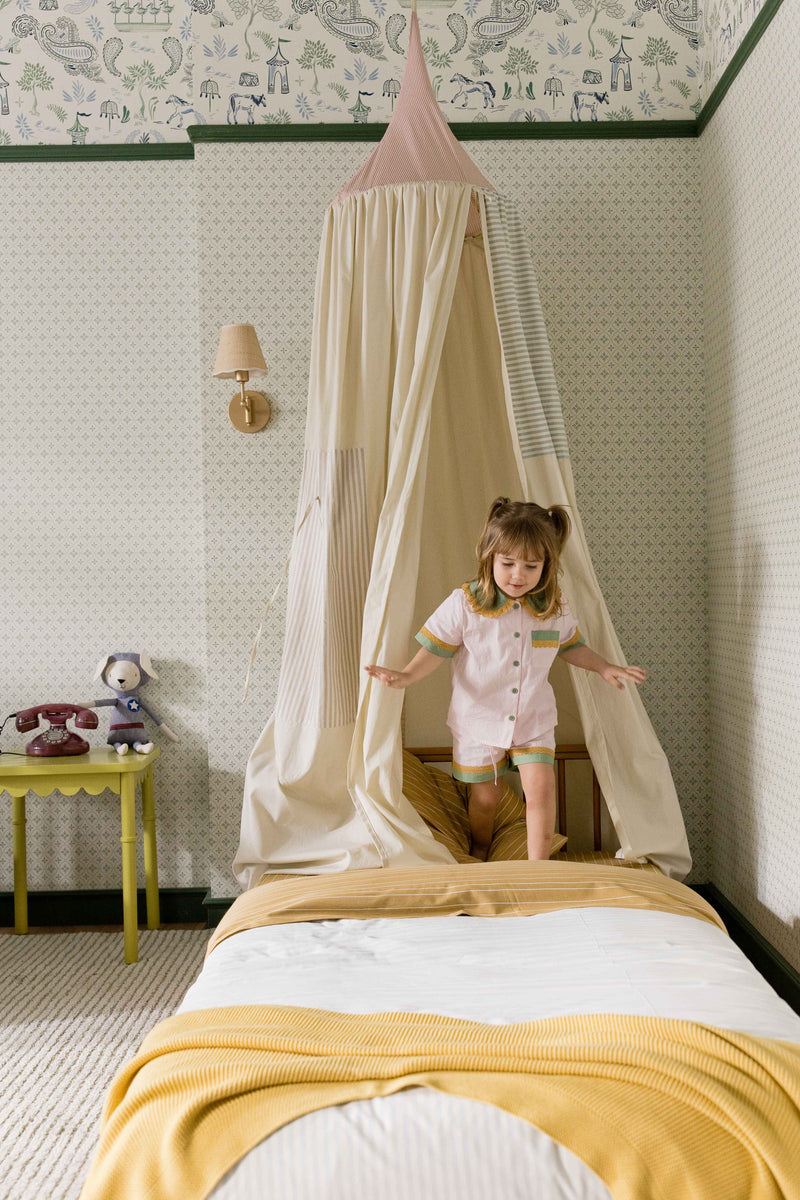
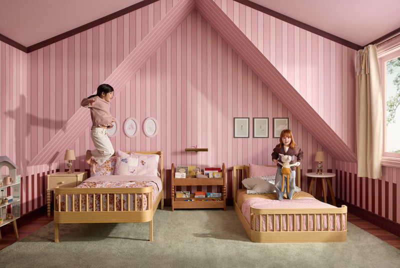
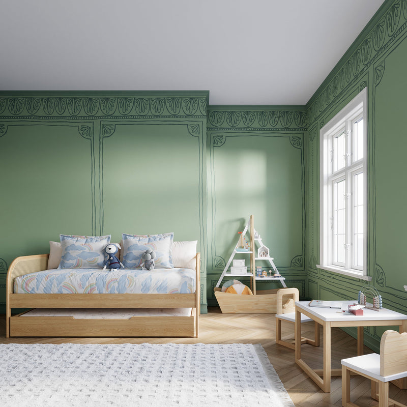
Maybe it’s the broader return to maximalism and color, but it seems prints and patterns are reclaiming their place in the home and this is especially true when it comes to seating. Florals, gingham, cabana stripes, even small-scale geometrics are showing up on sofas, gliders, and reading chairs in ways that feel less fussy and more intentional. The key? Choosing prints that feel architectural and fresh rather than overly nostalgic.
“‘Sad beige,’ or otherwise neutral, minimalist spaces, have been the default for design-leaning parents for some time,” shares freelance editor and founder of the antique and vintage home decor shop, Ça Marche Shop, Laura Lajiness Kaupke. “There’s a renewed appetite for color, print, and personality. Patterned seating in kids’ spaces feels like that same pendulum swing toward something more expressive,” she adds.The result isn’t grandma-core. Done right, it feels layered, collected, and imaginative.


When incorporating pattern seating, like gliders or reading chairs, in a kids room think beyond a fleeting moment of whimsy. Patterns shouldn’t feel like an add-on. When incorporated intentionally, they become an instant mood booster and can even anchor the room, versus being an afterthought. “I think parents are craving something more whimsical, imaginative, and wonder-filled for their children—spaces that feel joyful and inspiring rather than restrained.”
Circle of Friends’ Hilliary Salamanca agrees, “Patterns are one way to express personality into a space and bring dynamic visual interest.”
Children’s spaces are an ideal place to experiment with patterns, especially through seating. “It’s almost an opportunity for parents to indulge in their own sense of childlike wonder,” Lajiness Kaupke shares, “especially when the rest of the home may skew more restrained. A more-is-more sensibility in kids’ spaces allows for bolder color, pattern-on-pattern layering, and playful motifs in a way that still feels intentional.”
After all, this is a room meant to spark play and creativity, making it the perfect backdrop for expressive choices that might feel too vibrant elsewhere in the home.
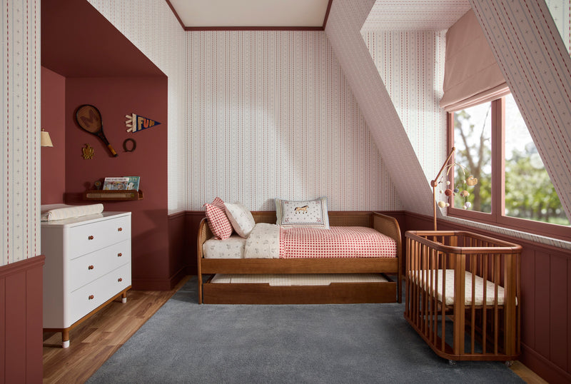
Not all prints are created equal. “Ticking stripes, small-scale florals, and traditional checks are timeless patterns that never feel outdated in a child’s space,” Lajiness Kaupke says. “They’ve endured for generations and feel rooted in history rather than trend cycles.”
Salamanca adds that timelessness is personal when it comes to prints. “There are patterns that are used time and time again—animal prints, stripes, florals—but even these fall in and out of trend cycles in their popularity and usage. I believe in finding what feels timeless to you. If it’s something you’ll love for years and it can function across different phases of your home, that’s what makes it timeless.”
Don’t pick a print because it’s trending right now. Pick it because you’d still love it when your toddler is ten.


Pattern works best when it’s balanced. “It always comes back to grounding elements,” Lajiness Kaupke says. “A checked chair feels far more enduring when paired with a ticking stripe or a solid ottoman, rug, or window treatment.”
Layering patterns with timeless wood furniture, whether a minimalist early American–inspired form or an English pine piece with scalloped aprons and chunky turned leg—roots the room in history and prevents it from feeling theme-y.
“It’s about finding the right scale, color story, and supporting elements,” Salamanca adds. “Pattern adds depth and personality, which makes you love the space more—and that emotional connection is what creates permanence.”